

Your campaign was working.
People were clicking. Orders were coming in. Nobody was refreshing the dashboard with one eye closed.
Then something changed. The cost per purchase started climbing and click-through rates dropped. The same creative that performed brilliantly three weeks ago could no longer convince anyone to buy a bottle of shampoo.
Naturally, the first instinct is to increase the budget. Spending more money showing people something they are already tired of seeing is not much of a strategy.
What is creative fatigue?
Creative fatigue is what happens when an audience has seen an ad often enough that it stops registering. The first impression did its job. By the fifth, the ad has become part of the furniture, and in a feed built to be scrolled past, furniture gets scrolled past.
It is worth separating from two things that look similar on a dashboard.
Audience saturation is a reach problem. You have shown your ads to most of the people your targeting can reach, so the same faces keep seeing them. A new ad helps less here than a new audience, a new offer or a new market. In a market the size of South Africa, a tightly defined audience can be exhausted quickly.
Then there are the causes that have nothing to do with the ad. Demand moves with the season. Competitors push auction costs up. A price changes, the site slows down, stock runs low, or tracking stops counting purchases it used to count. Every one of these produces the same sad graph, so it pays to find out which one you have before you treat it.
The warning signs
Fatigue tends to announce itself in a cluster of small changes.
Frequency creeps up, meaning the average person is seeing the ad more often. Click-through rate falls. The cost of getting a purchase rises. The share of people who click and then buy may slip. Reactions and comments thin out, because people who have seen something nine times rarely feel moved to say anything about it.
No single one of these proves anything. A high frequency number is normal in a retargeting audience, where the whole point is to follow people who already know you. A falling click-through rate could be the creative, or a different audience, or just a different week.
Context does the diagnosing. If click-through rate is falling while frequency climbs and the cost of reaching a thousand people holds steady, the ad is the likeliest suspect. If the cost of reaching people is what rose, look at the auction and the calendar before you look at the artwork. If people are still clicking but no longer buying, the problem has moved past the ad to the page, the offer or the price.
The cleanest test is also the simplest. Put a genuinely different ad in front of the same audience and see what happens. If it performs, you were looking at fatigue. If it falls over too, the creative was never the whole story.
Changing the headline isn't a creative strategy
When an ad tires, the usual response is to change the words. A new headline goes over the same photograph, the same product on the same background, and everyone agrees it is a fresh ad.
To the person scrolling, it is the same ad. They recognise the picture before they read a word, and the part that had stopped working is the part that stayed. A variation of the surface is still the old idea.
A new concept changes the reason to buy. Take one supplement and you can make the argument with a number, with a comparison against the alternatives, with a customer's own words, or with a list of what is actually inside. Each argument speaks to a different kind of shopper, and each of them looks nothing like the others on a phone.
When we plan a set, we move several things at once between concepts: the visual direction, so the thumbnail itself reads differently; the positioning, meaning what the product is compared with; the hook, which is the first thing a person is promised; the motivation underneath, whether proof, price, convenience or identity; and the format, because a testimonial and a spec panel ask the viewer to do different work.
If a new version differs from the old one only in the copy, it will fatigue on the same schedule.
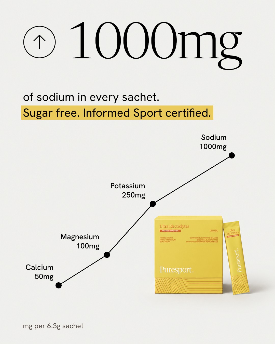
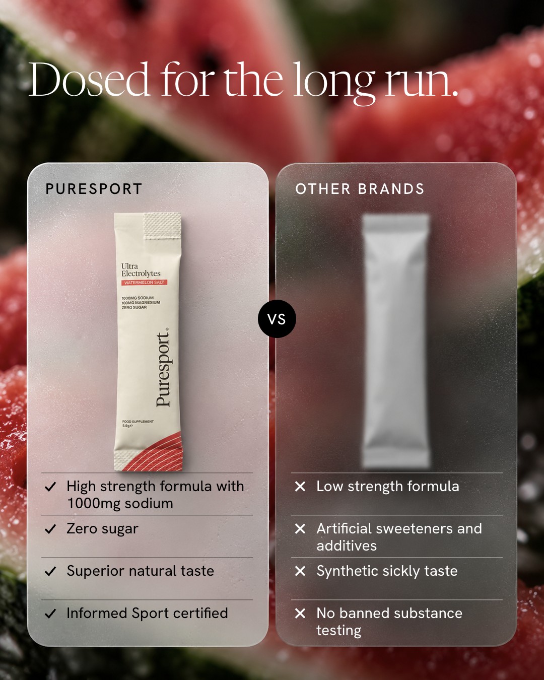
Your next winning ad probably isn't your last one
Most brands treat a winning ad as something to be preserved. They nurse it and run it until it dies, then start again from zero with no new idea in reserve.
A steadier approach is to develop several distinct directions at once and let the account tell you which people respond to. That takes a little structure.
Each test needs a reason behind it. "Shoppers who compare options will respond to a head-to-head more than to a testimonial" is a hypothesis. "Let's try a blue one" is a coin toss. Changing one thing at a time makes the result readable, and letting each test run long enough makes it trustworthy. Writing down what you learned, including from the ads that lose, means the next round starts from knowledge instead of instinct.
When a direction wins, iterate within it: new angles, new proof, new formats of the same argument. While you do, the next direction should already be in preparation.
Diversity matters more than count. Ten ads that make ten different arguments teach you more than ten ads that make one argument ten ways, which is why a brand's formats work as different doors into the same system. For the volume side, we have written about how many creatives a month a serious account needs.
Better creative doesn't always require another photoshoot
A shoot day is a good way to make one set of images. It is a slow and expensive way to find out which of six concepts will work, and one set of images can seldom supply six concepts anyway.
Modern production gives brands more room. Photography establishes how a product really looks and feels. Design and art direction decide what is worth saying and how to arrange it. AI-assisted workflows then extend that foundation: new scenes, compositions and formats built from the real product references, produced quickly enough to test several ideas in a month.
That last part deserves care. Producing more options does not make any of them better, and AI does not know which idea is good. Direction does that. Used well, it is a production capability. Used carelessly, it produces a large volume of equally forgettable ads.
It also helps if the ads stay editable once they exist. We build ours as a photograph with no text in it and the words set on top as separate layers, so a headline or a price can change without regenerating the picture. We have written about how editable ads are built.
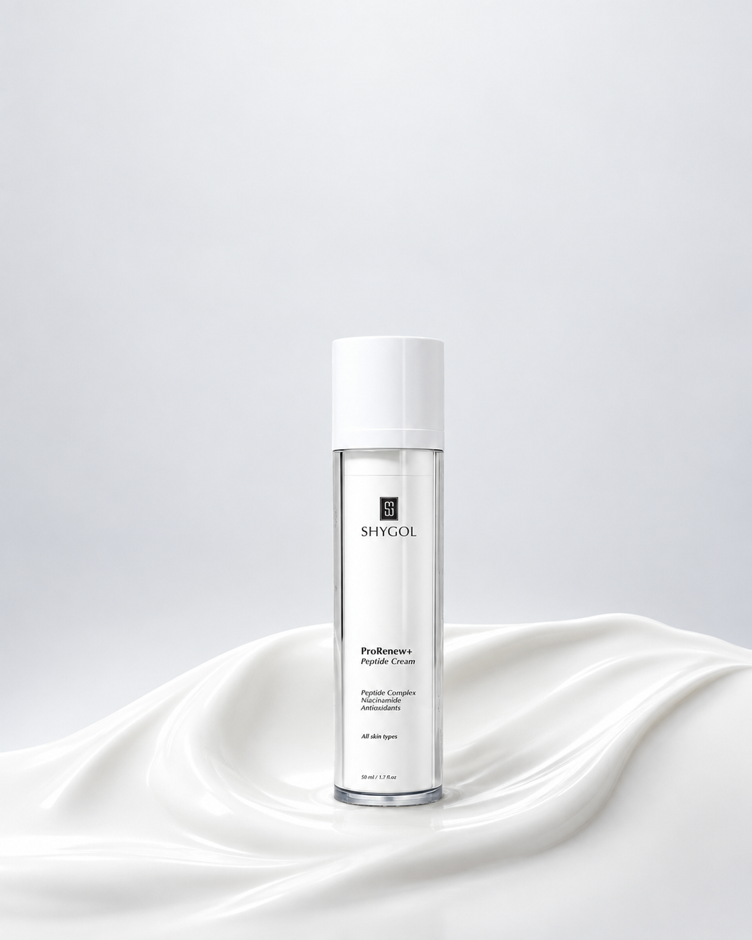

The Shygol and Puresport work we show is conceptual. It was made for ourselves, with no brief from the brands and no campaign data, and we make no claim about how any of it would perform. What it demonstrates is a method.
The creative is part of the strategy
It is tempting to think of an ad account as a targeting and budget problem with some artwork attached. Audiences, bids and placements get the attention because they live in the interface and come with numbers.
Those levers are available to every advertiser, and as the tools get more automated, accounts increasingly resemble each other. The ad is the one part that meets the person. It decides whether someone stops, and what they believe about the product in the second and a half they give it.
When performance slides, the question worth asking before the budget conversation is whether the people seeing your ads have anything new to look at.
Your next winning ad probably isn't another version of your last one.
Studio Default is an independent creative department in Johannesburg. We develop product imagery, campaign creative and paid social assets for ecommerce and DTC brands, built to be tested and replaced.