

Puresport, four ad formats, two looks.
A performance-nutrition brand's four proven ad formats rebuilt as editable static ads, in two treatments and two ratios, then joined into one continuous carousel.
The brief
Puresport
Puresport is a British performance-nutrition brand: electrolytes, energy gels, magnesium and recovery, presented with unusual editorial restraint. We took four ad formats as a self-directed brief with one question. Can the same four ads run in two different looks, in a feed ratio and a full-screen ratio, and still read as Puresport every time?
- Brand
- Puresport
- Category
- Performance nutrition
- Ad formats
- 4
- Treatments
- Standard and minimal
- Ratios
- 4:5 and 9:16
- Type
- Self-directed concept work
The system
The system came first.
- 01
Layout first
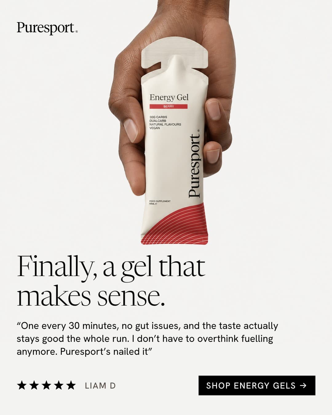
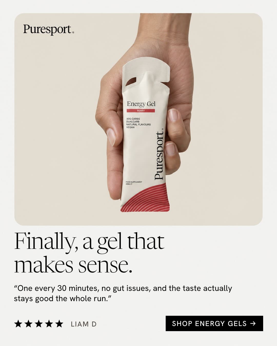
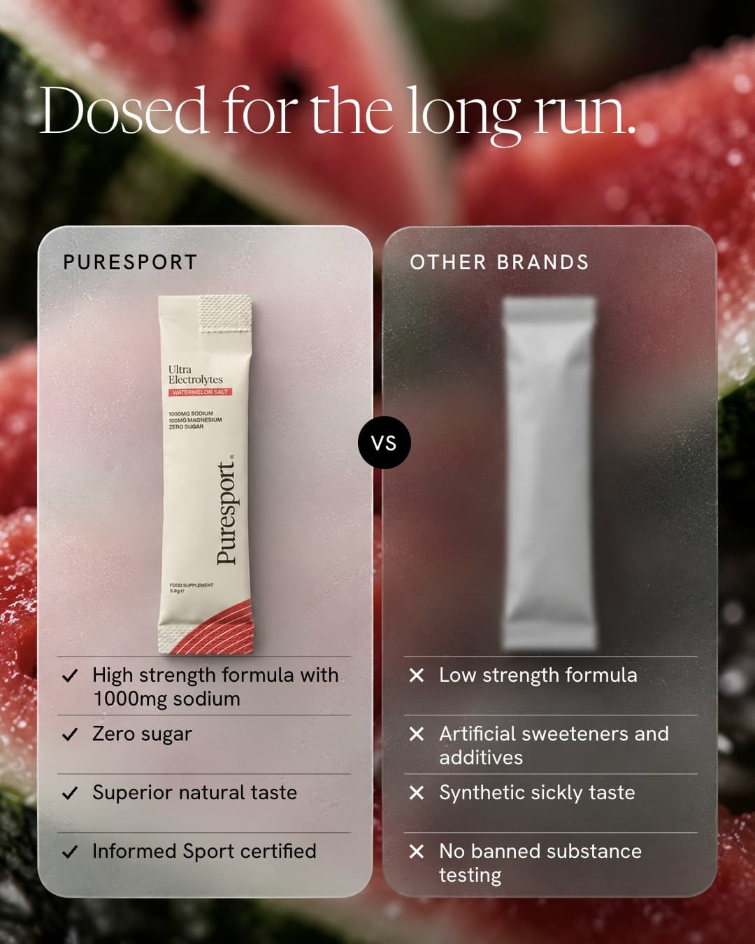
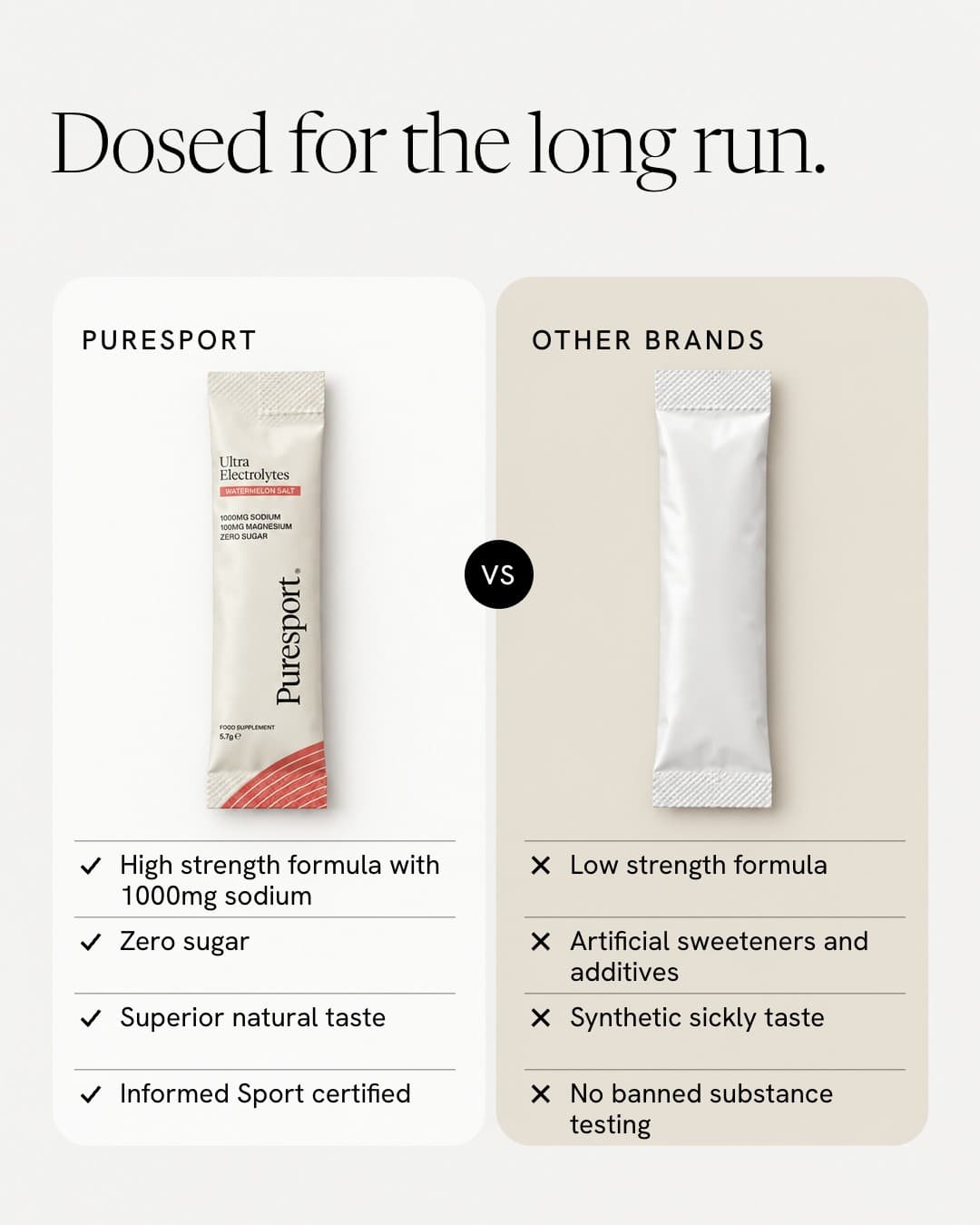
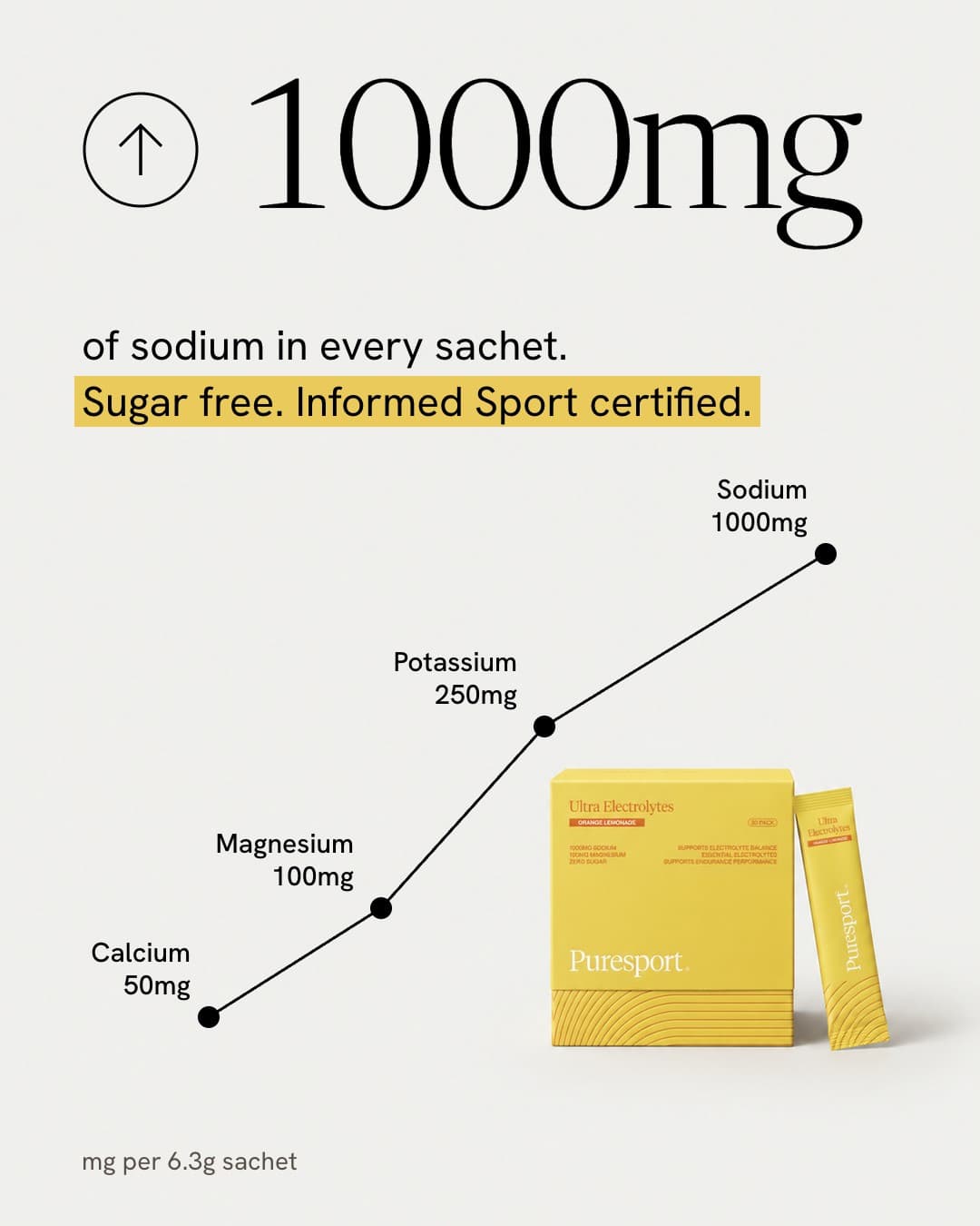
Each ad starts from a format that already works in paid social: a checklist, a review, a stat with a trend line and a head-to-head comparison. We kept the structure, mapped where the product and the copy sit, and left the other brands' looks behind.
- 02
A photograph with no text
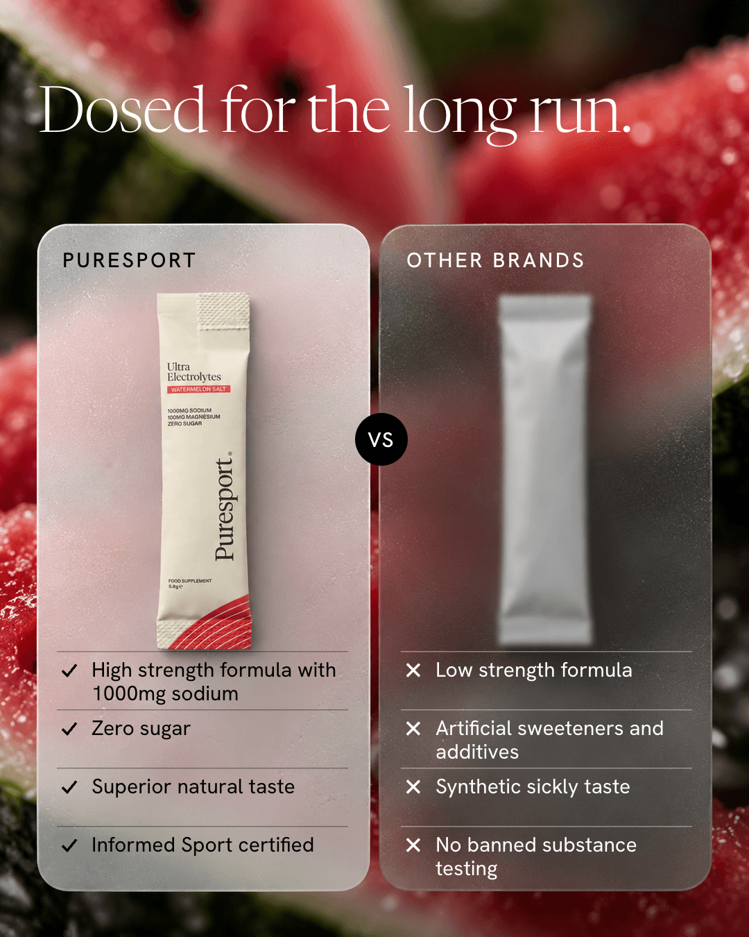
Every photo is generated with no words or interface in it. The headline, the numbers, the star rating and the button are set on top as live text, so the claims on each ad are spelled and spaced exactly as intended.
- 03
Two treatments
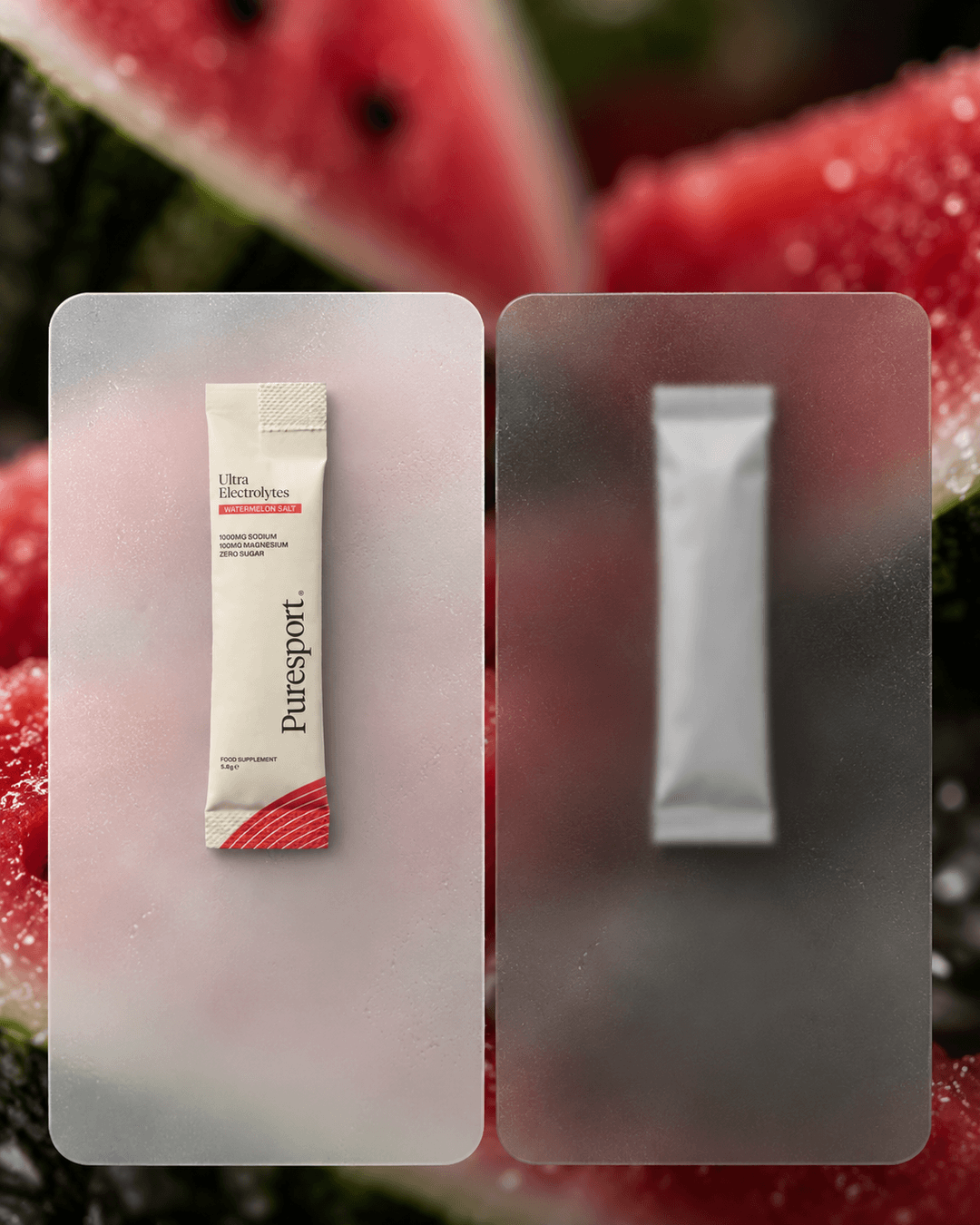
Standard sets the product and the copy straight onto the photograph or the ground. Minimal puts the product in a rounded card on a clean off-white ground. Same copy, same product, two ways into the brand.
- 04
Claims from the brand's own pages
Every number and benefit on the ads comes from Puresport's product pages. The other brand in the comparison is a plain unmarked sachet, so no competitor is named or shown.
Product shots
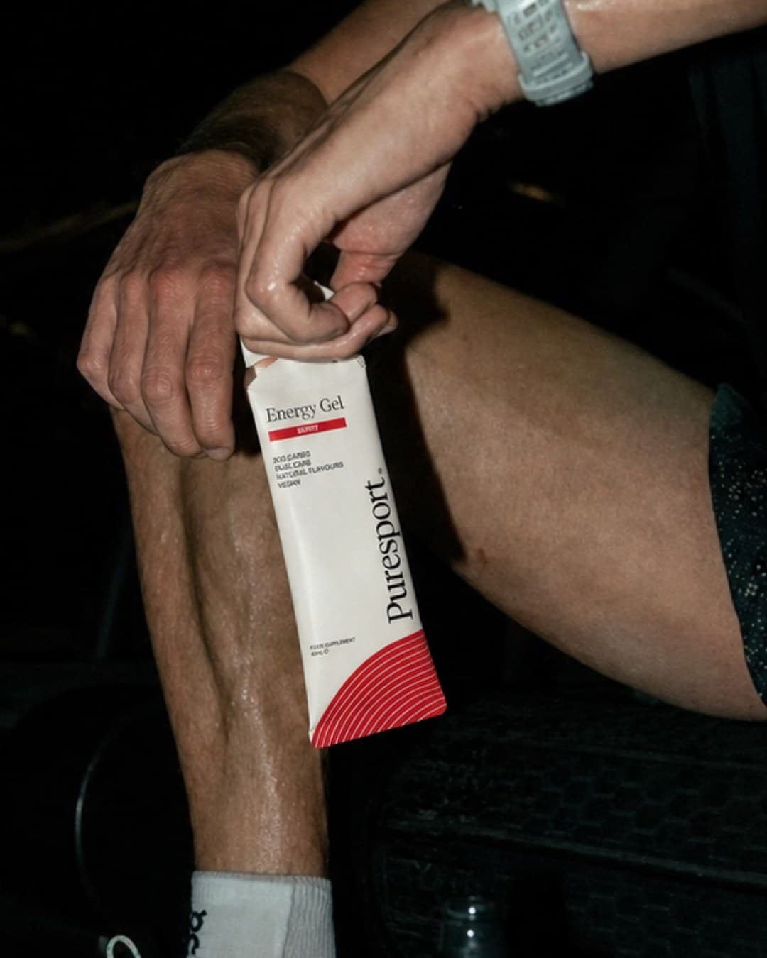
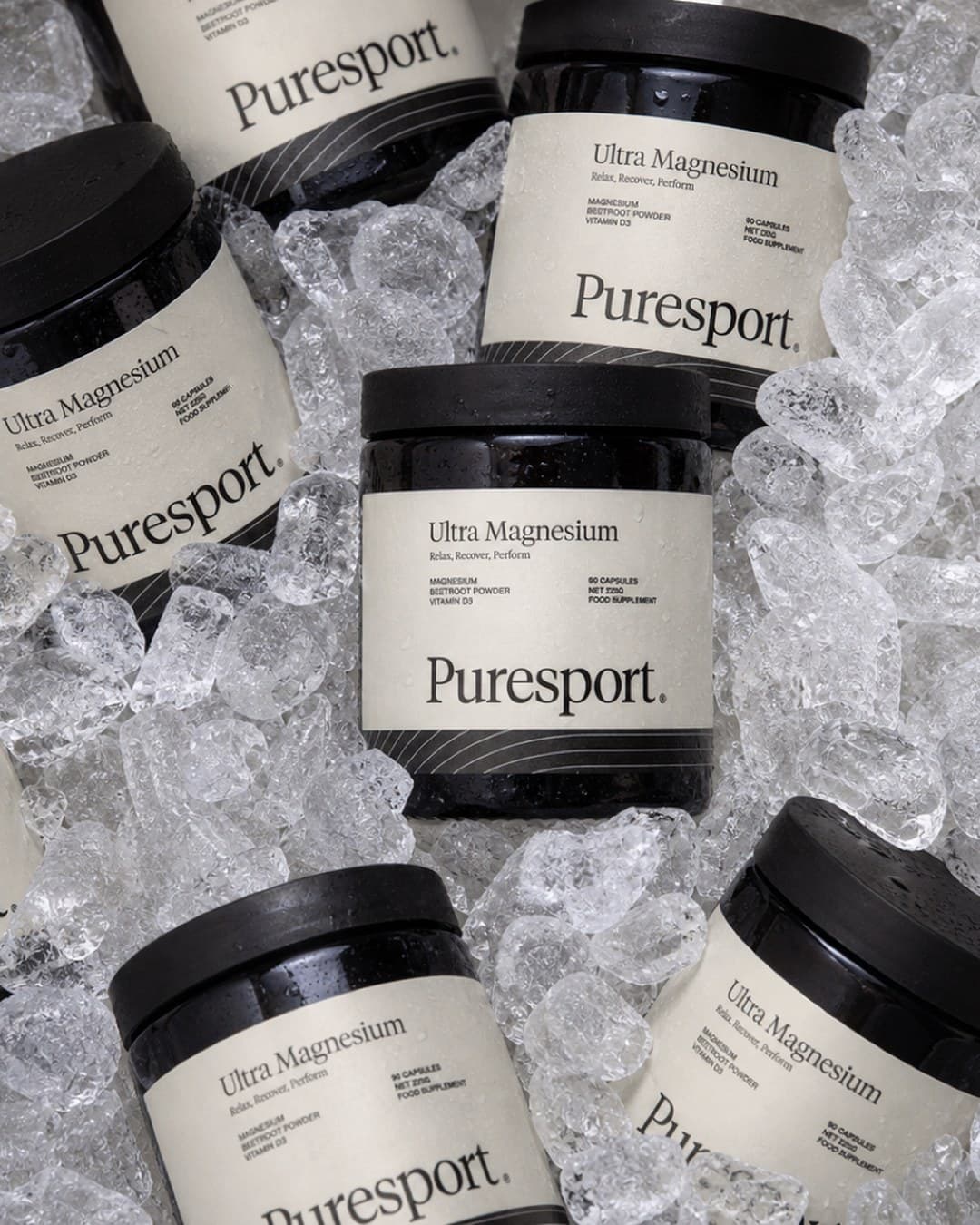
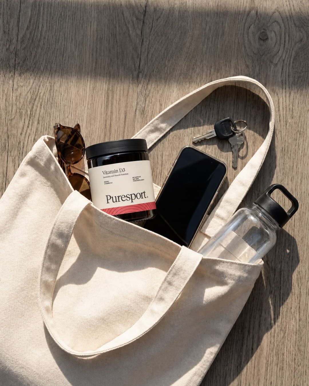
Static ads

One strip, three slides.
Four 9:16 ads at full height are each 810 pixels wide, and four of them fill a 3240 pixel strip that cuts into three 1080 by 1440 slides with nothing left over. The second and third ads cross a slide edge, so the carousel moves as one picture when you swipe.
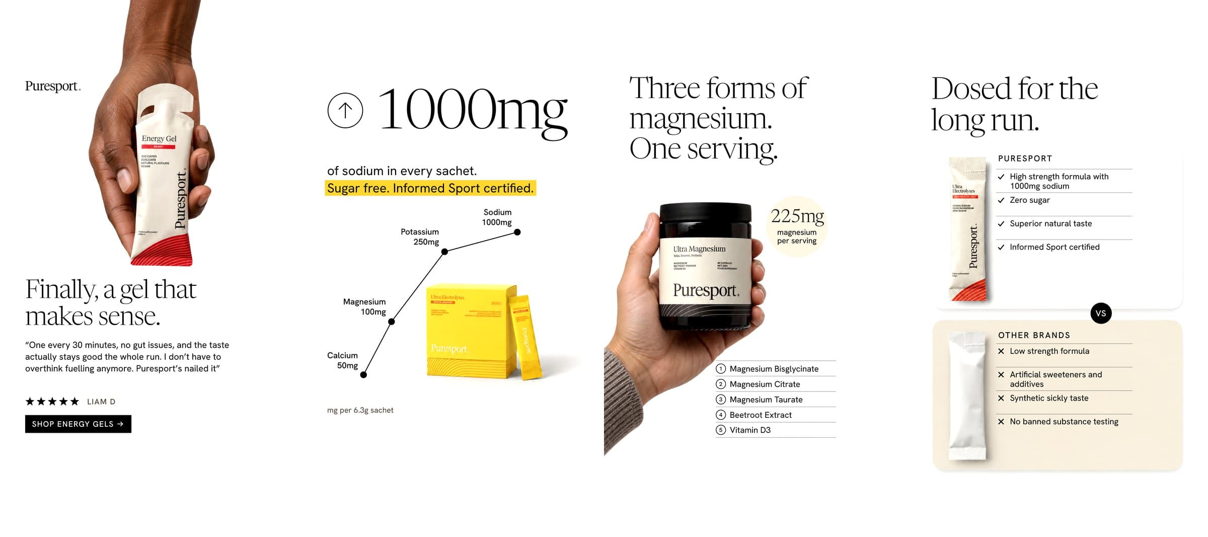
Ads that stay editable.
Each ad is built in two layers. The photograph carries the light, the fruit and the product. The headline, both lists and the badge sit on top as live text, so a claim or a language can change without regenerating the picture.
Related reading
Where each ad started.
How each of these ads started from a format that already works, and what we kept and what we left behind.
Delivered
What was made.
- Four static ad formats: checklist, review, stat and comparison
- Each in two treatments, standard and minimal
- Every ad in 4:5 and 9:16, 16 finished ads in all
- Ads built on separate photo and text layers, ready to edit
- One continuous three-slide carousel cut from four 9:16 ads
Self-directed concept work. We set the brief. Not affiliated with, endorsed by, or commissioned by the brands shown.
Next
What we would do next.
The range is 31 products and we have shown four. The next round would carry the same four formats across the other flavours and the creatine, add a motion version of the stat ad where the trend line draws itself, and translate the set for retail partners.
Related