

This is a finished Puresport ad. One number, one rising line and one product, and a single blue block was enough to plan the photograph.
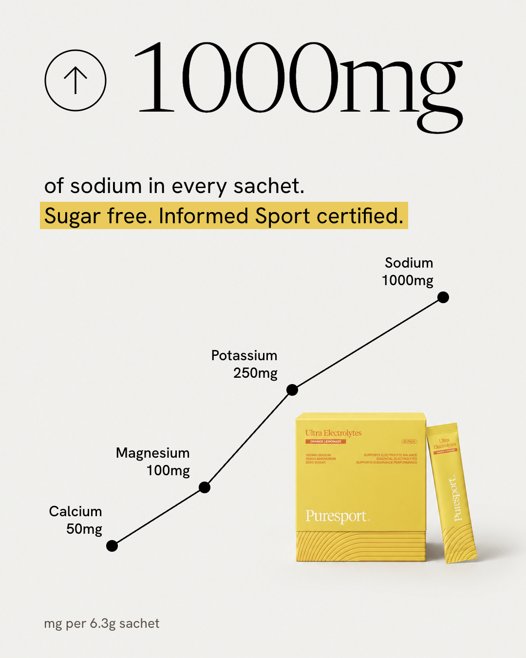
Most strong paid social ads have a layout doing much of the work. Before we make an ad for a brand, we pick one that already performs and work out what its layout is doing.
That layout is the part we keep. Its colours, photography and typefaces stay with the brand that made it.
Read the structure
We ask four things of the reference ad. How many blocks does it have? Where does the eye land first? How big is the product against the frame? How much of the frame is left empty on purpose?
For this one the answers were short. The statistic is the picture, so it takes the top of the frame. A line climbs from lower left to upper right, which tells you the story before you read a label. The product is small and sits low, in the corner the line is climbing away from.
Draw it as a blocking guide
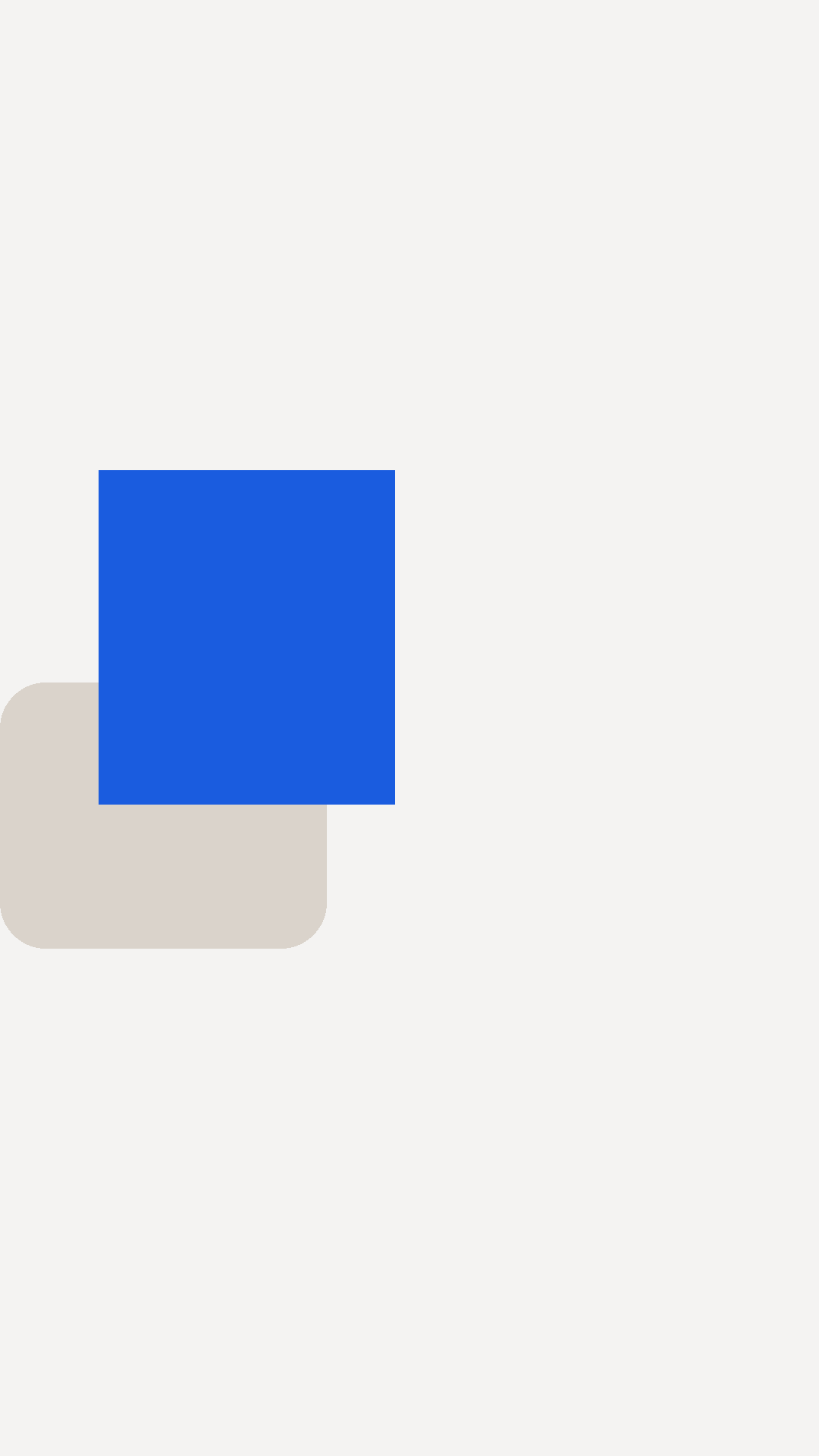
We draw that structure as a plain image: a pale frame and a blue block where the product goes. It has no colour, no type and no photograph in it. Each element carries one decision, such as position, size or how much room stays clear.
For this ad the guide has exactly one element, a single block at the lower right. The number and the line are not in the photograph, so they are not in the guide.

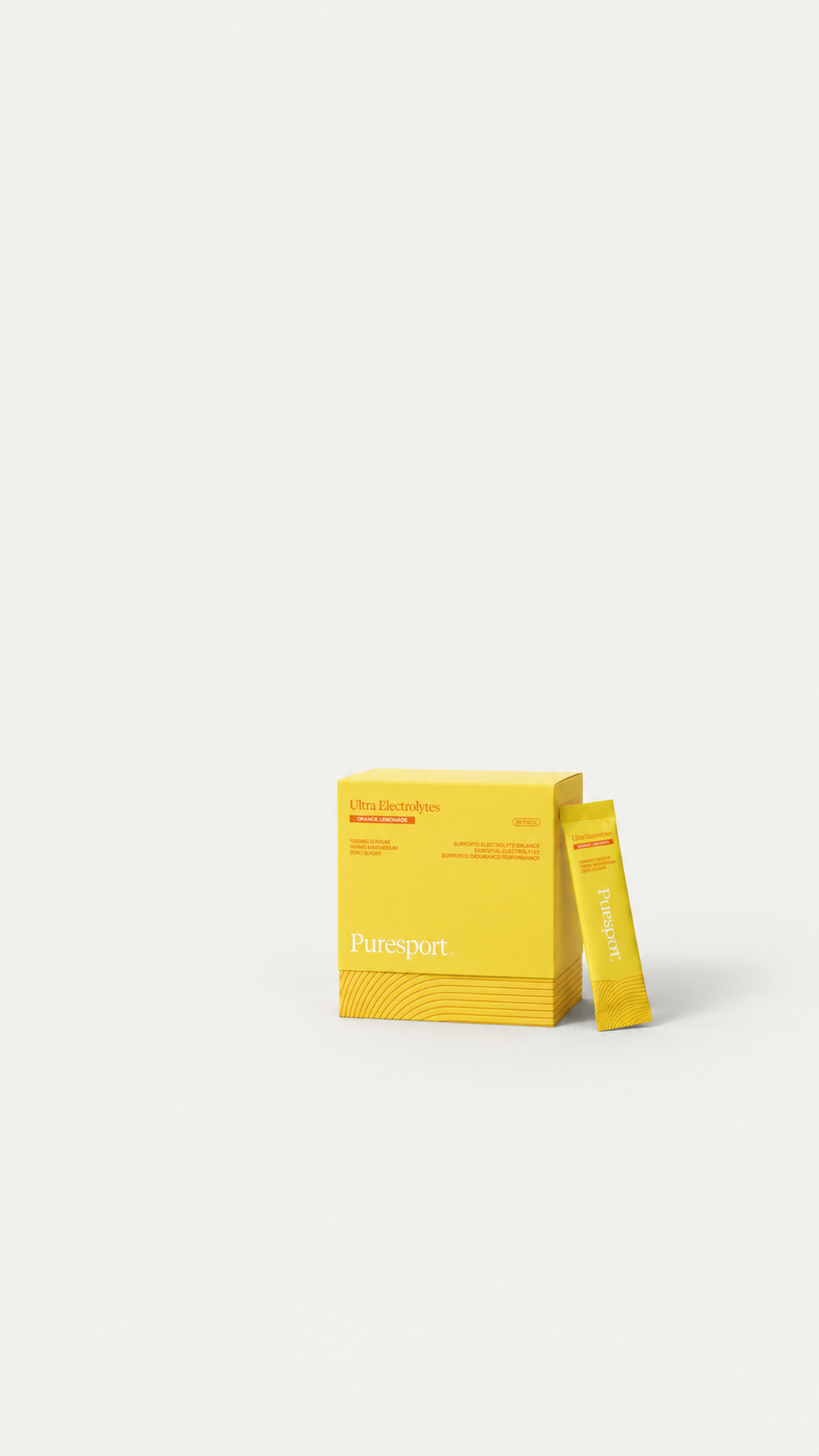
Build the photograph against the guide
The guide goes to the image model as the layout, and the real product references go in as the content. What comes back is the box and sachet standing where the blue block was, at true scale, with clear ground on every other side. The photograph carries no text.
Put the words on top
The headline, the highlighted line, the chart, the axis and the labels are set as live text and drawn shapes over the photograph, in the brand's own fonts. The four figures on the chart are the real nutrient panel from the product page, so they can be corrected later without regenerating anything.
The same method on other formats
The stat ad is one of four. Each started from its own reference and its own guide.
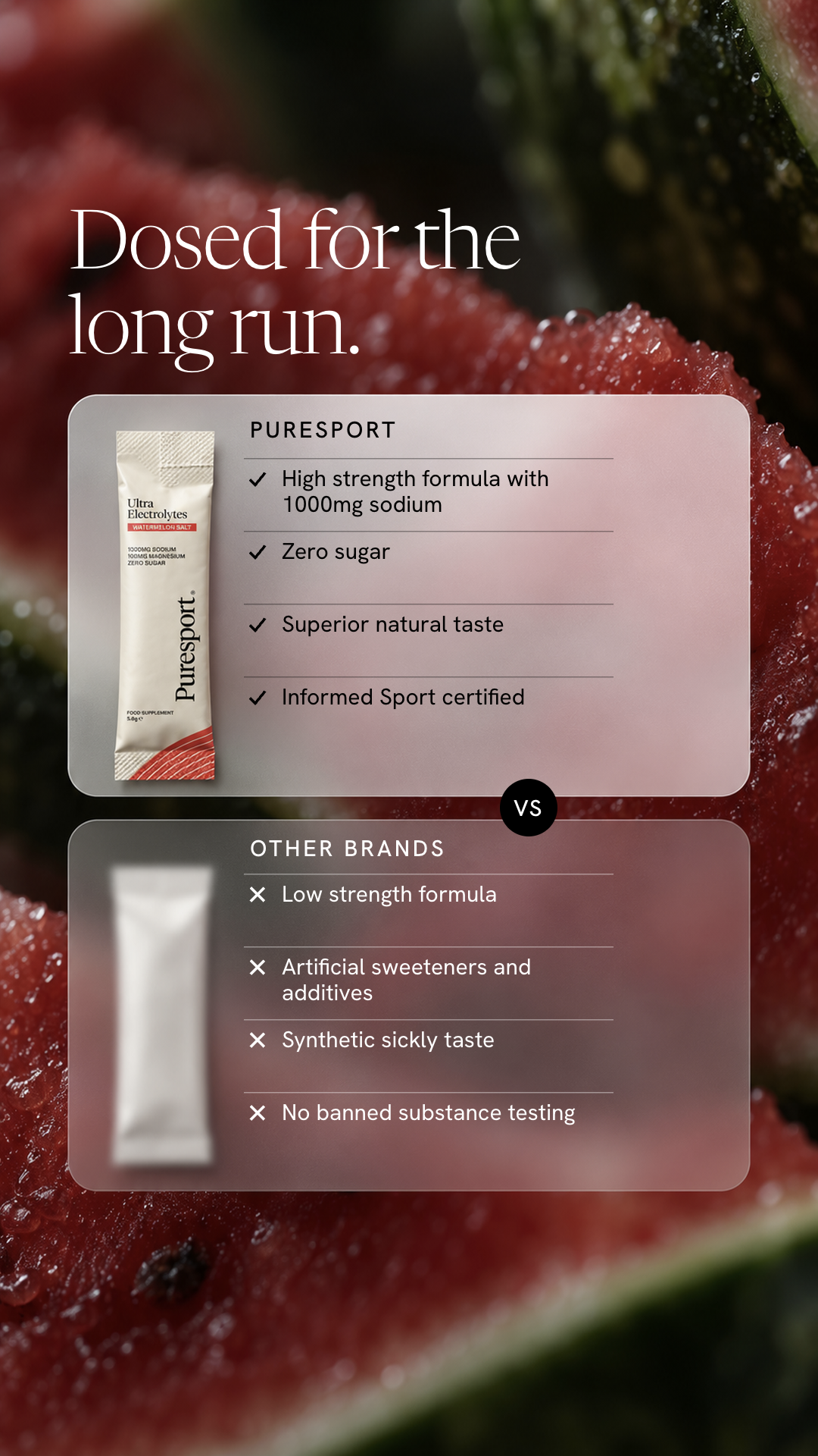
The comparison ad needs two marks, one per panel, plus a clear band at the top for the headline and open lower halves for the lists.
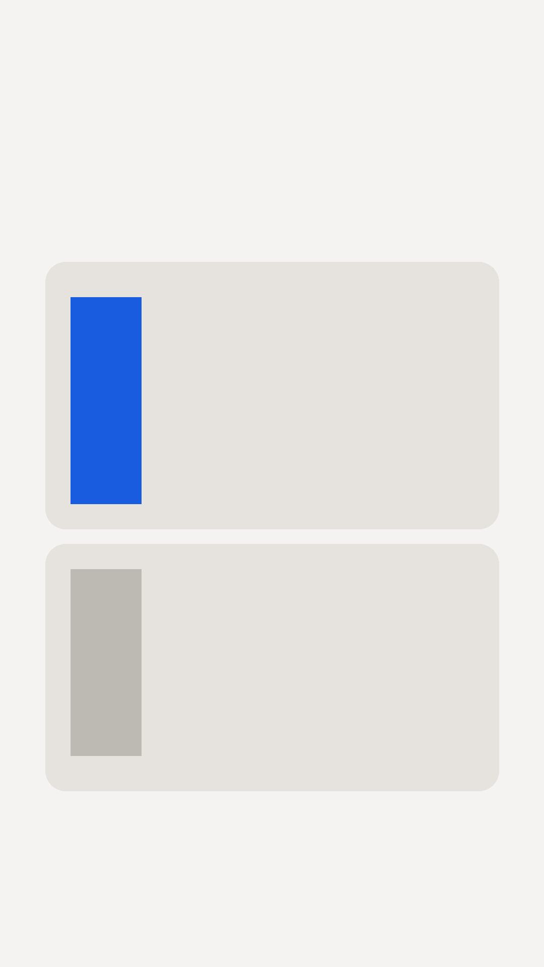
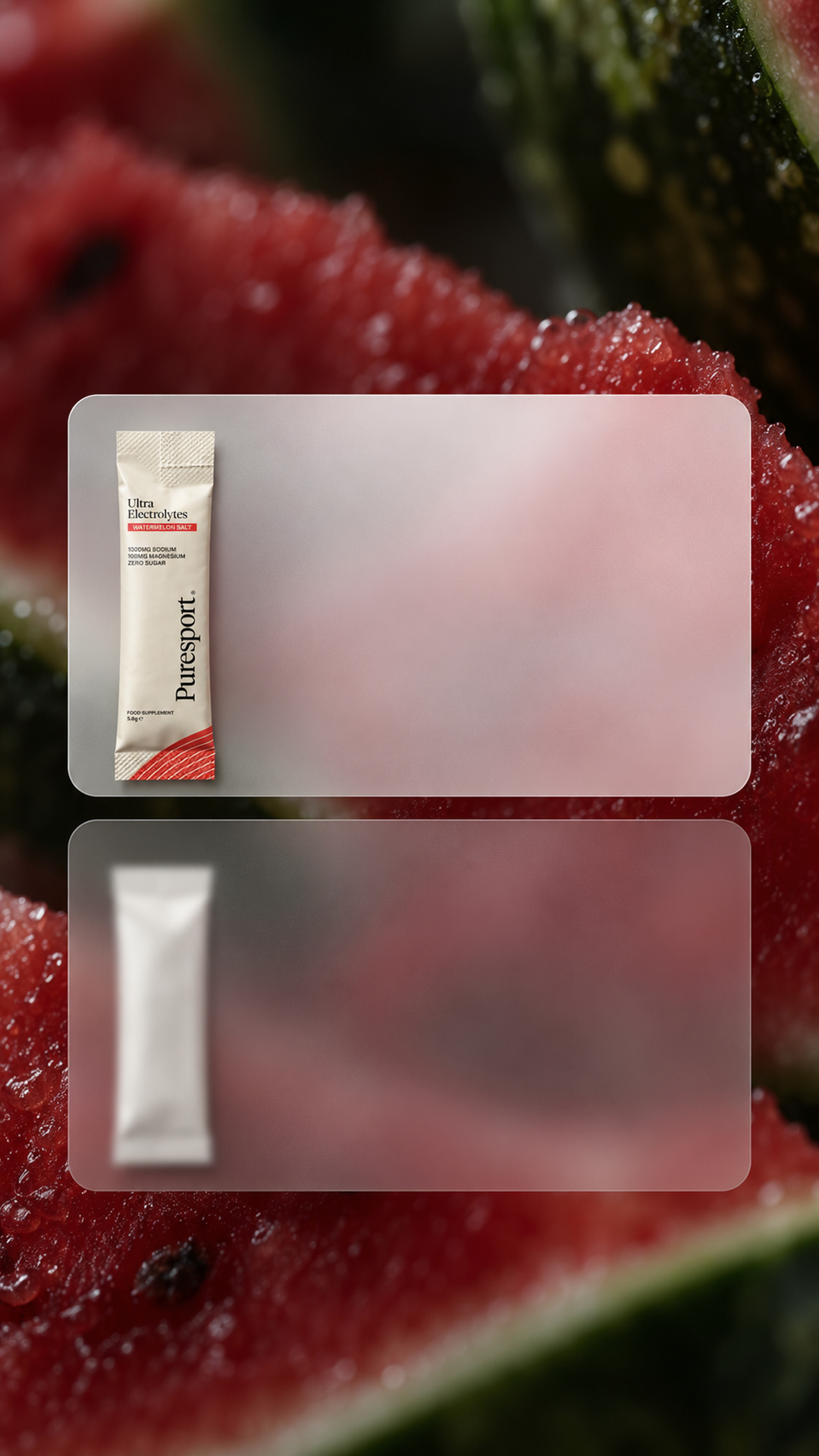
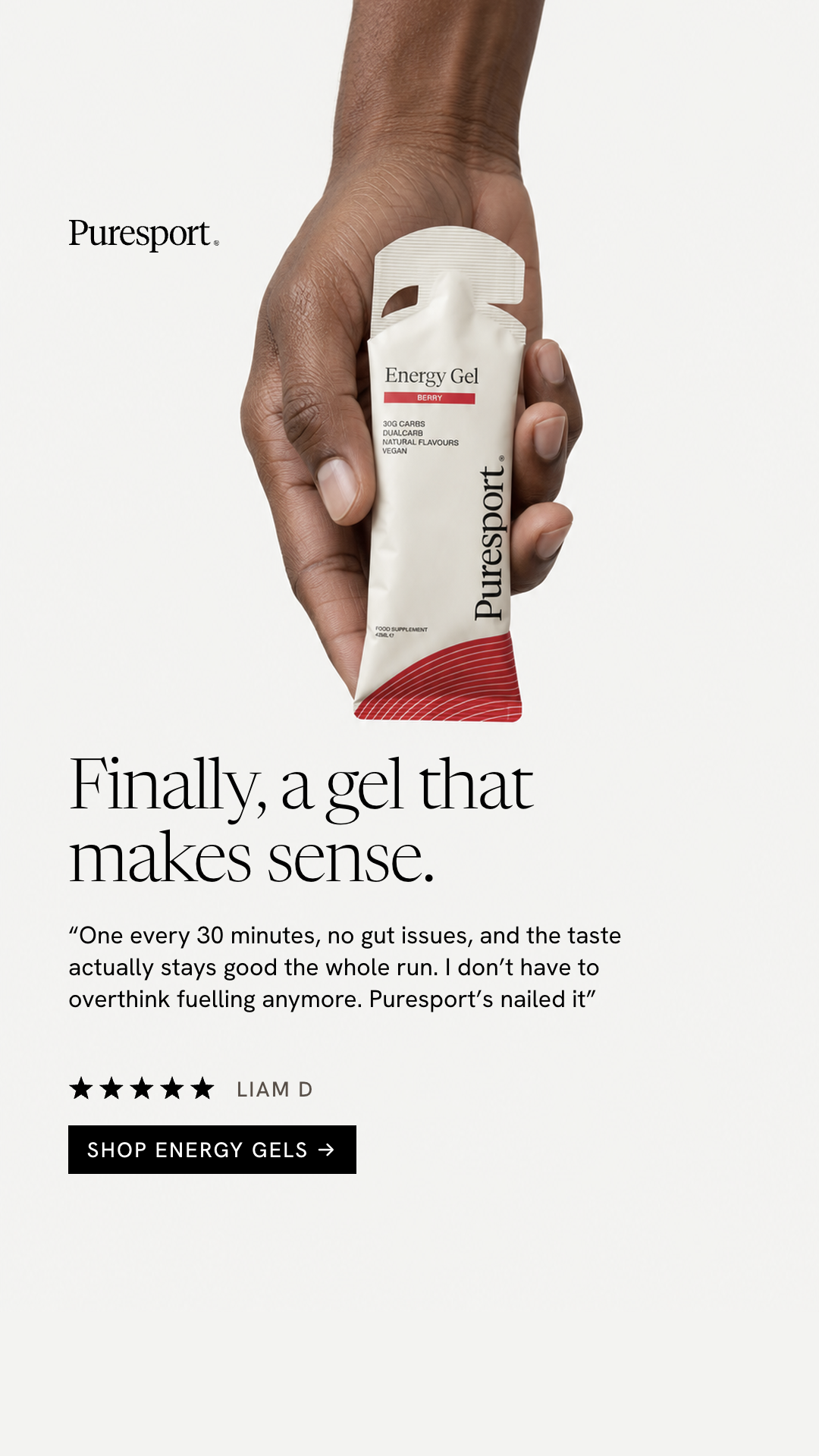
The review ad sits at the other end of the scale: a skin-toned block reaching down from the top edge with a blue block inside it where the gel sits, and everything below left clear for the headline, the quote and the button.
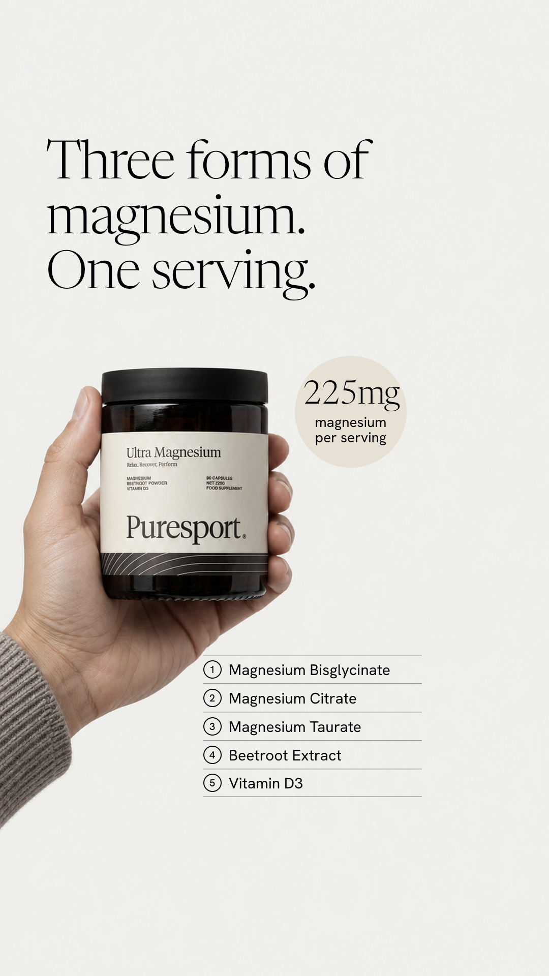
The checklist ad is the busiest. A forearm and hand enter from the bottom left holding the jar, which leaves the top and the whole right half empty. That space is where the headline, a badge and a numbered list of ingredients land.
Check what stayed behind
Put the reference and the result side by side with the logos covered. If the two ads share a skeleton and nothing else, the layout was the only thing borrowed. If a colour, a font or a photographic style has crept across, it needs to come out before the ad goes anywhere.
Why this order works
A format earns its place by working on people who are scrolling. The look belongs to whoever made it. Starting from layout lets each ad sit entirely inside the Puresport world and still read at a glance in the way its format does.
The guide also gets reused. The same one produced the feed version, and a second guide drawn for a taller frame produced the full-screen version.
Puresport is self-directed concept work. We are not affiliated with the brand.