

ULA Skin, in black and white.
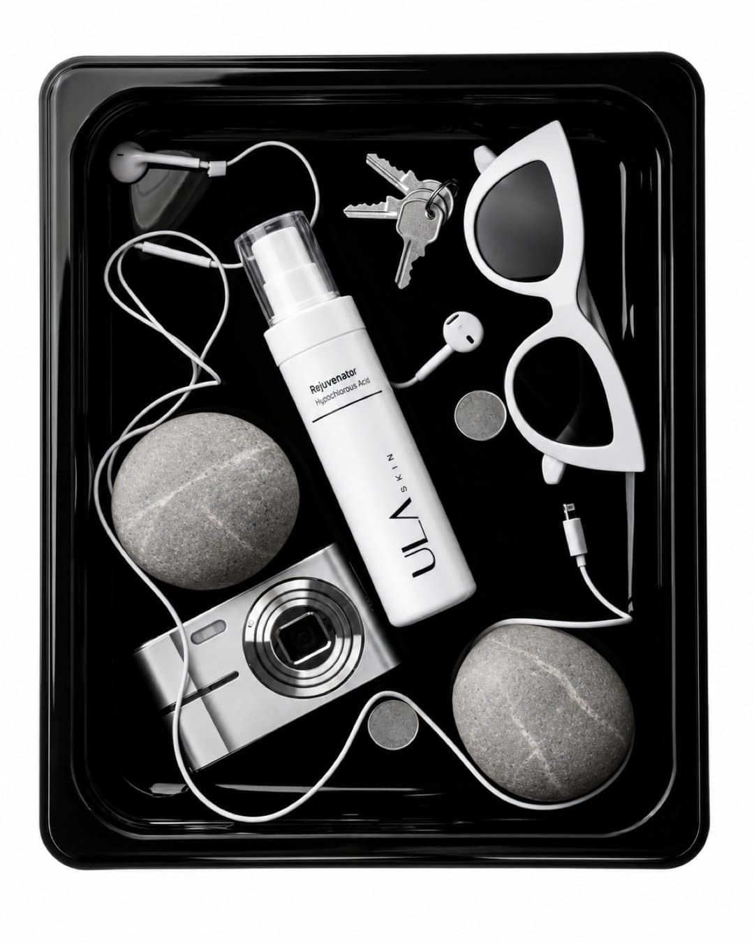
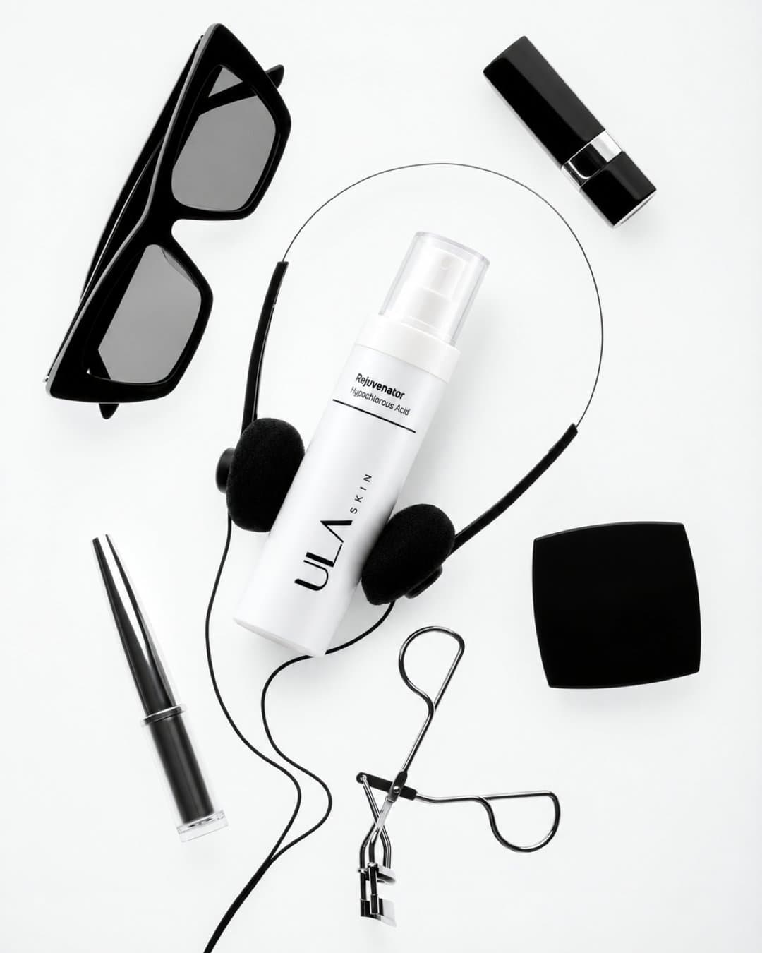
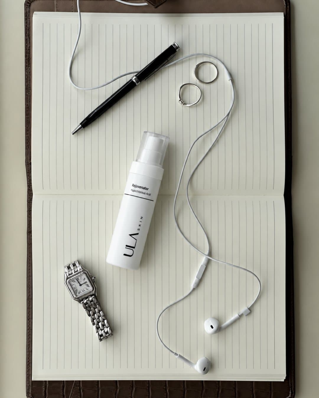
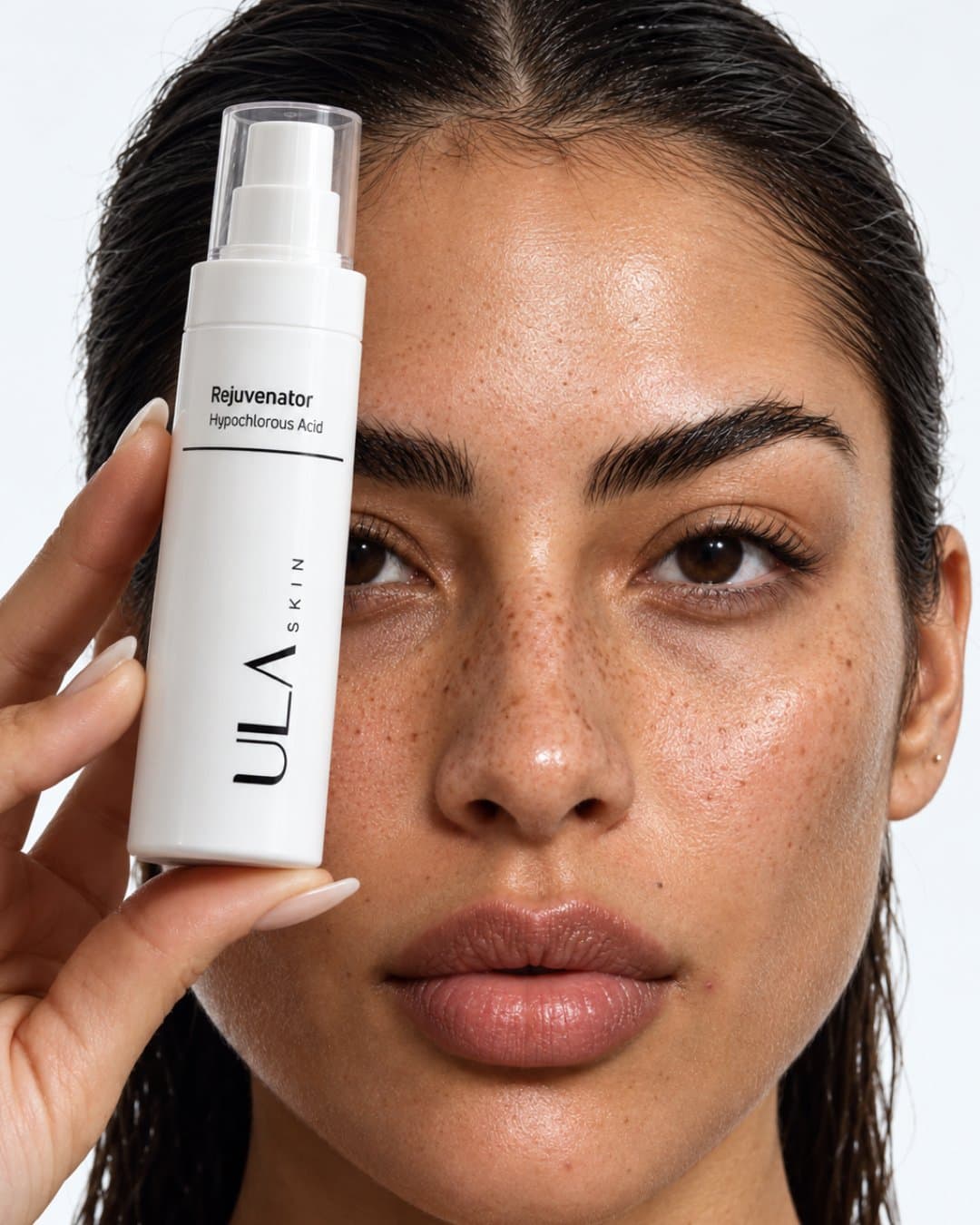
A South African skincare brand with one hero molecule, shown as a strict monochrome system: product shots, model imagery and static ads that stay calm and clinical from frame to frame.
The brief
ULA Skin
ULA Skin is a South African skincare brand built around one gentle hero molecule, hypochlorous acid, for reactive and post-treatment skin. We took it as a self-directed brief with one rule: no accent colour, no clutter. Every frame, whether a flat lay, a portrait or an ad, has to feel as calm as the product.
- Brand
- ULA Skin
- Category
- Skincare
- Hero product
- Rejuvenator Spray
- Formats
- 4:5 and 9:16
- Type
- Self-directed concept work
The system
The system came first.
- 01
Strict monochrome
Black, white and grey only. A neutral, desaturated grade with deep blacks, crisp whites and a matte finish, never warm.
- 02
Light
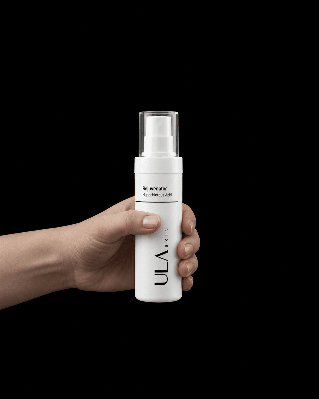
Either a single soft key raking the bottle out of near-black, or clean even light on off-white. Heavy negative space throughout.
- 03
A locked product
The real Rejuvenator bottle is the reference for every frame, so the label, cap and proportions hold across flat lays, portraits and ads.
- 04
One typeface
A single geometric sans in capitals for headlines, set as live text in the ads next to the wordmark.
Product shots
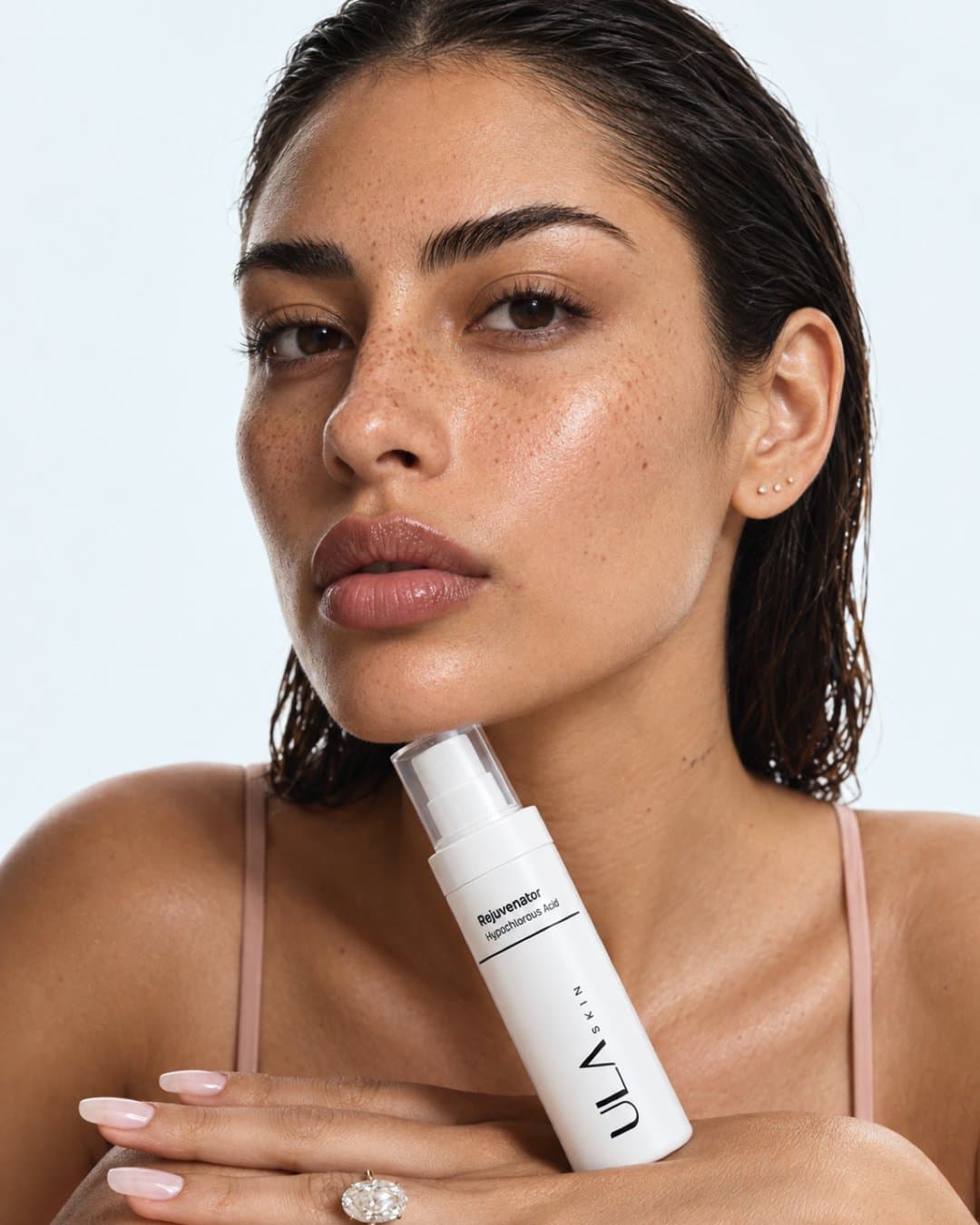
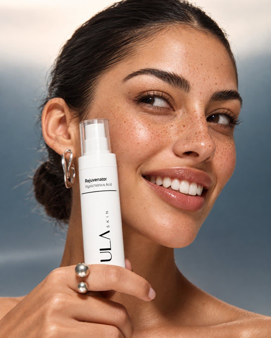
Model imagery
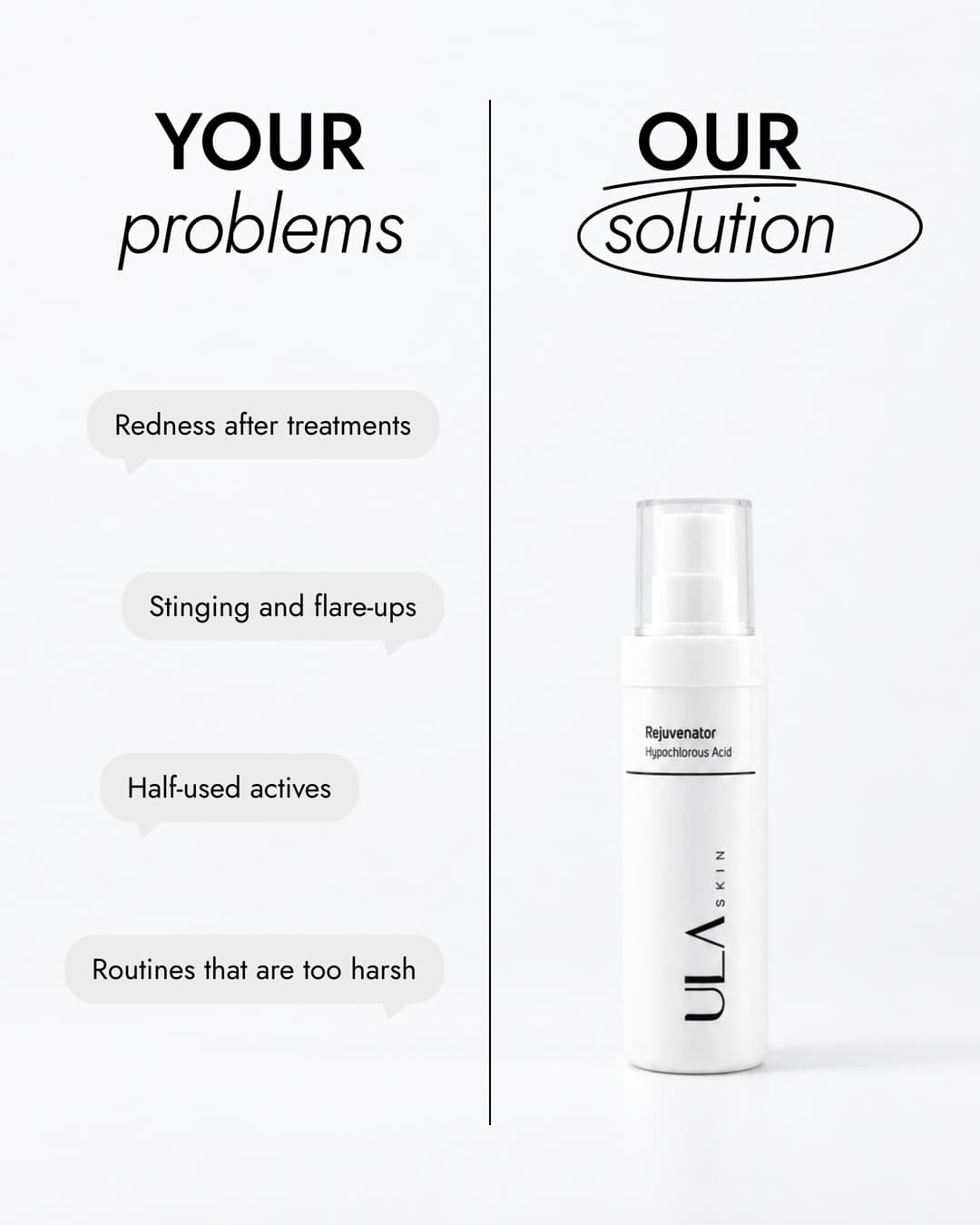
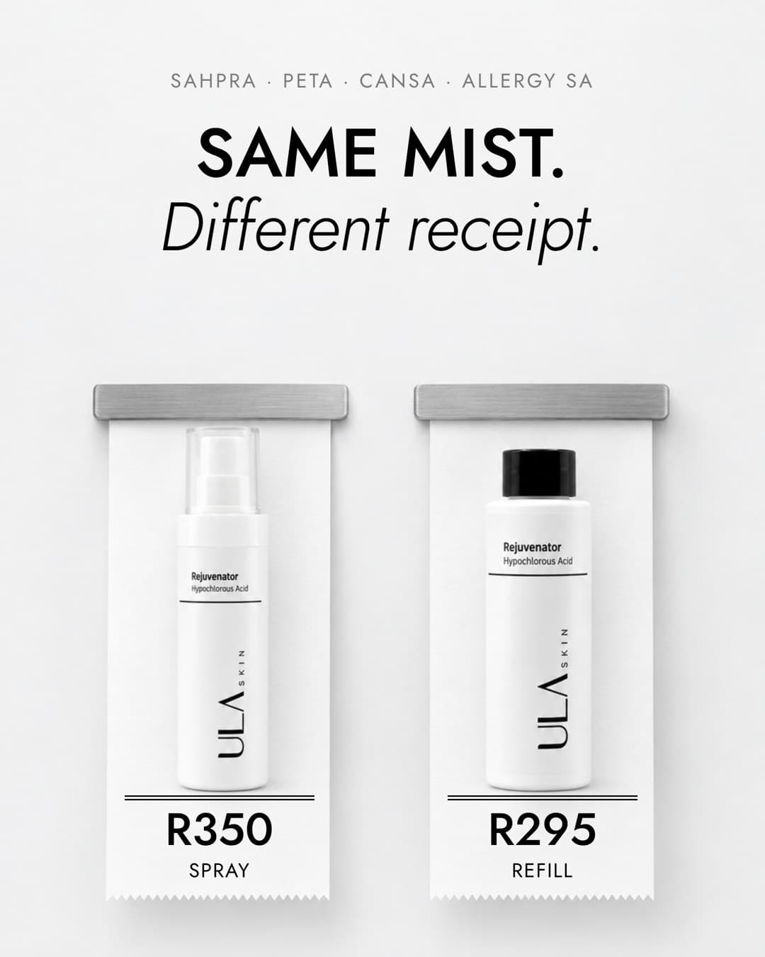
Static ads
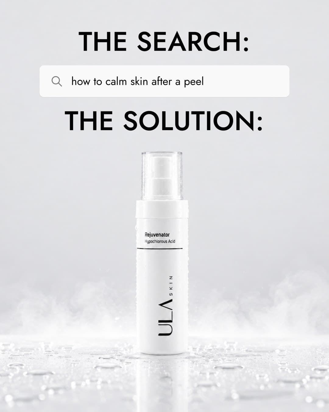
Designed in Paper.
Every ad was designed in Paper, a design tool where each element stays a live object. The same file produces the 4:5 feed version and the 9:16 full-screen version, with the layout rebuilt for each and the same copy underneath.
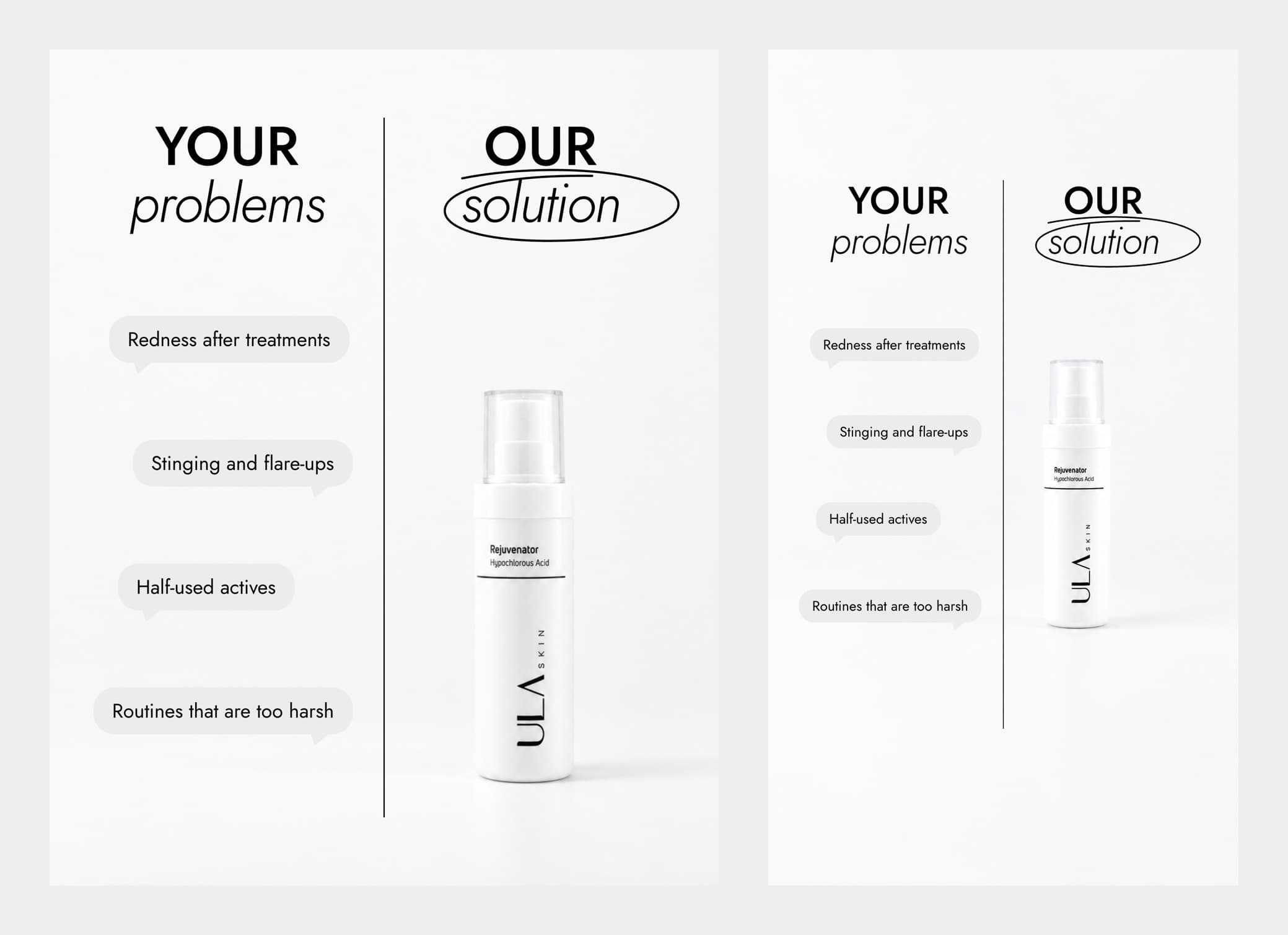
Ads that stay editable.
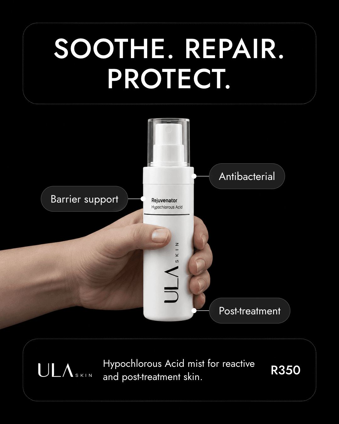
Each ad is built in two layers. The photograph carries the light and the product. The headline, benefit labels, connector lines and price sit on top as live text in Paper, so a price, a headline or a language can change without regenerating the picture.
Delivered
What was made.
- Product shots in a flat-lay and still-life style
- Model imagery with a consistent casting
- A set of static ads designed in Paper, each in 4:5 and 9:16
- Ads built on separate photo and text layers, ready to edit
Self-directed concept work. We set the brief. Not affiliated with, endorsed by, or commissioned by the brands shown.
Next
What we would do next.
The hero spray has a refill, a travel set and a sun range. The next round would be a refill-led campaign, a clinic-facing set for post-treatment care, and motion versions of the strongest ads.
Related