

ROH, one system, many formats.
A scalp-care line shown in a single periwinkle world: product shots, model imagery and a spread of static ad formats that all read as the same brand.
The brief
ROH
ROH is a scalp-care line built on skincare logic: named actives and a focus on the scalp itself. We took it as a self-directed brief with one rule. One colour world, one product system, and enough ad formats that different people can find their own way in.
- Brand
- ROH
- Category
- Scalp and hair care
- Look
- Periwinkle monochrome
- Formats
- Poster, teardown, notification
- Type
- Self-directed concept work
The system
The system came first.
- 01
One colour
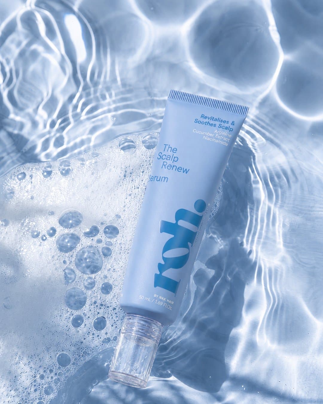
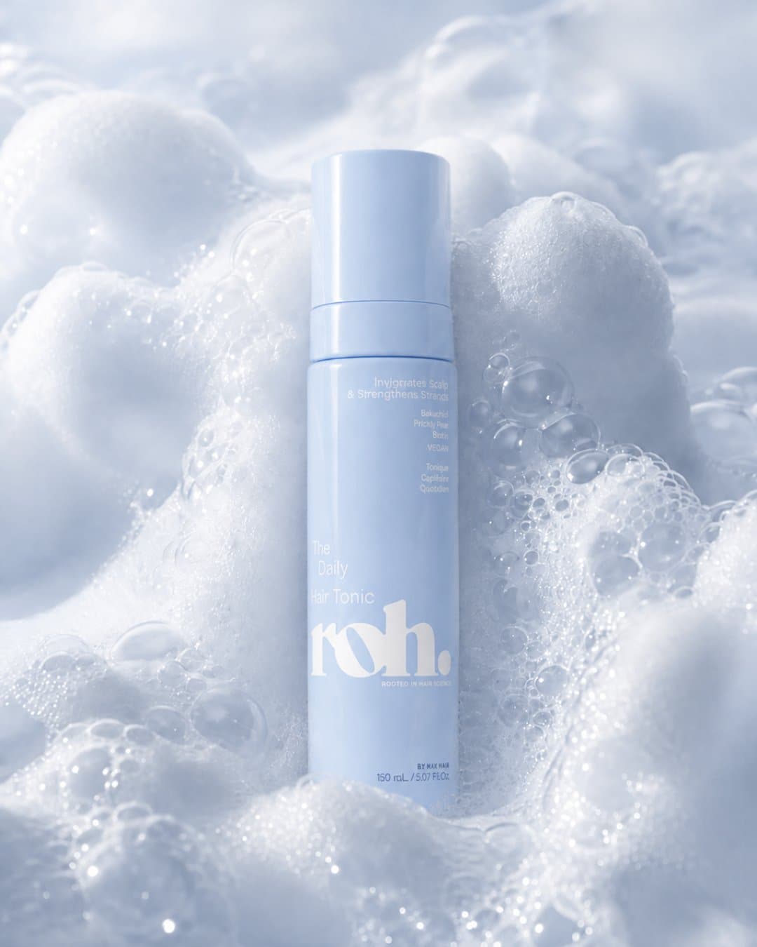
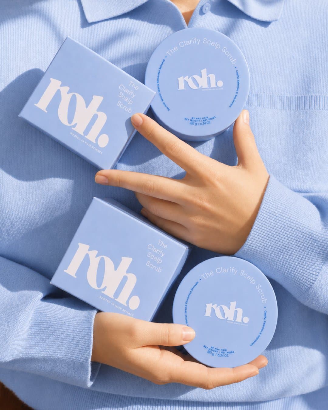
A single periwinkle blue carries the packaging, the backdrops and the type, so every frame reads as ROH before you see the logo.
- 02
Water and foam
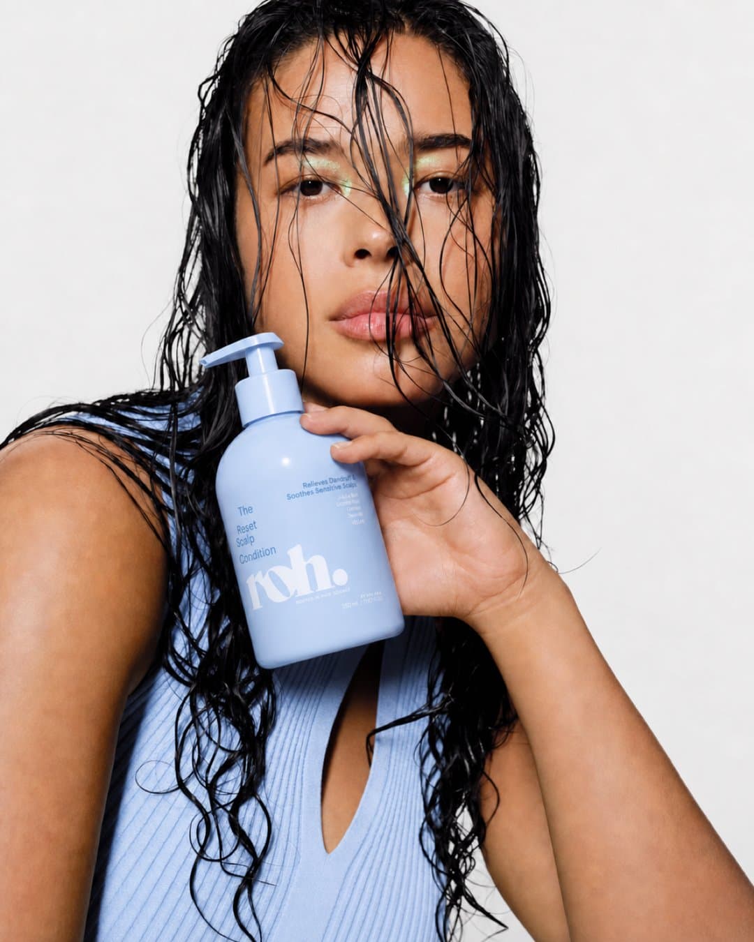
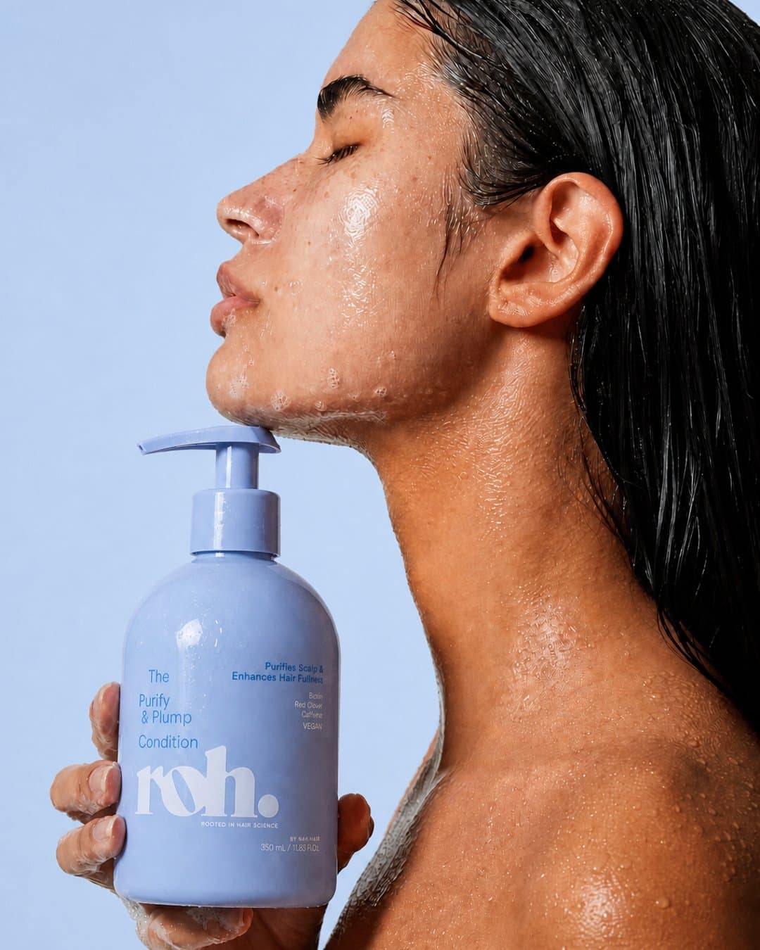
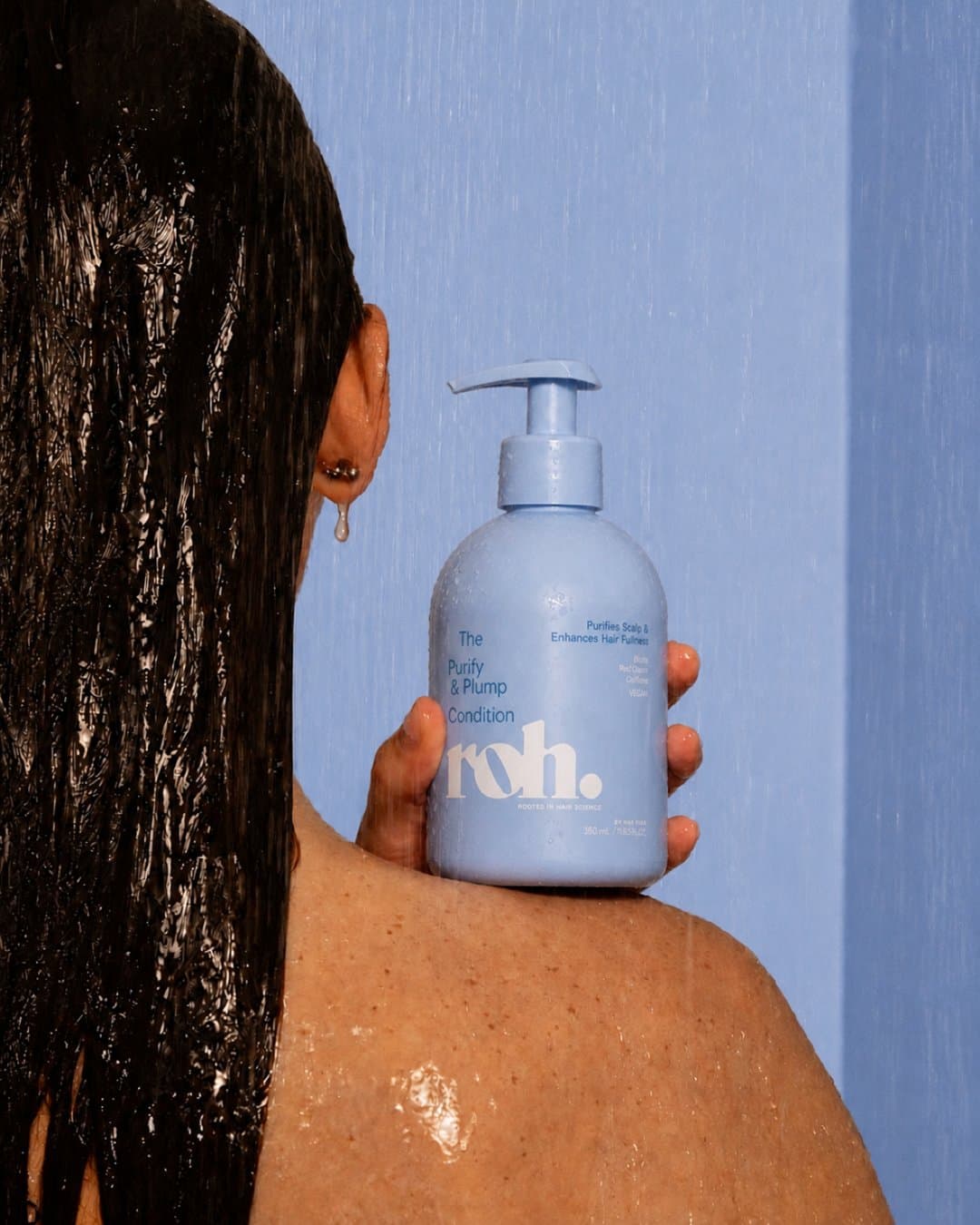
Wet hair, shower light, ripples and foam. The set stays close to the product's job so the imagery explains it.
- 03
A locked product
The real bottles, tubes and tonic are the reference for every frame, so the wordmark, cap and proportions hold across the range.
- 04
Formats as doors
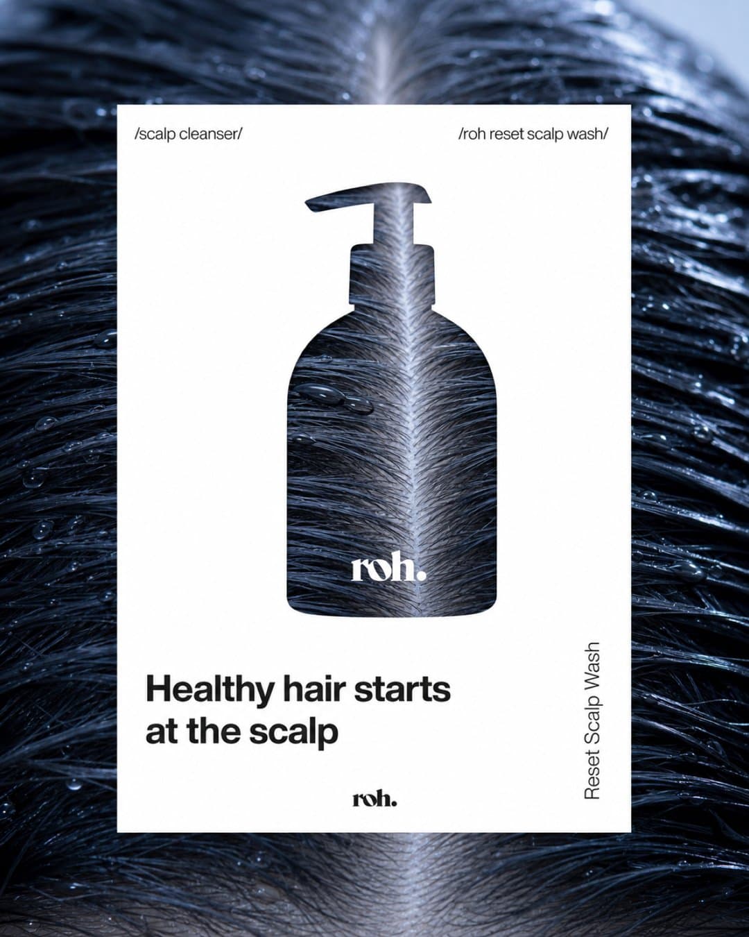
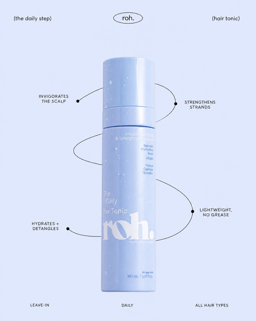
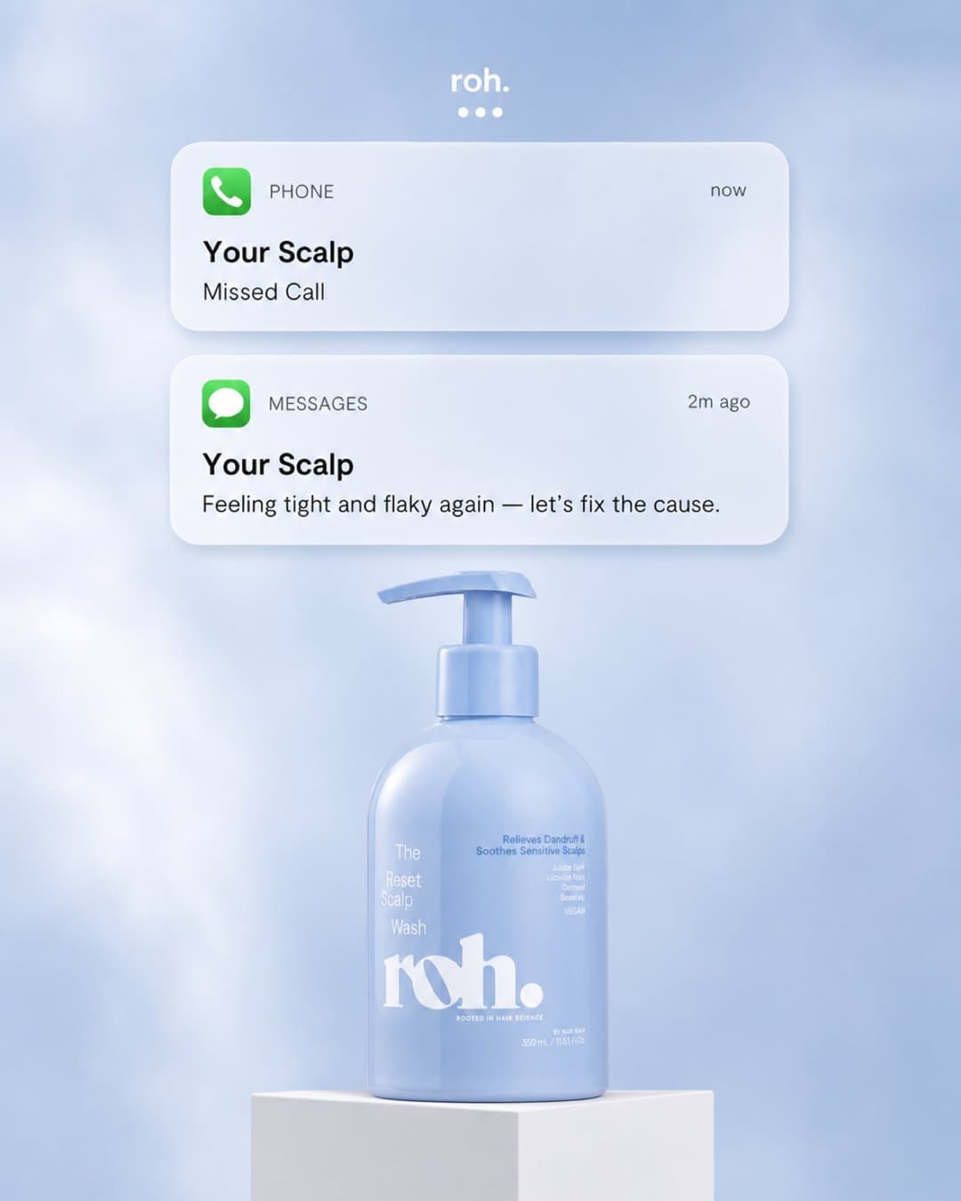
A knockout poster, an ingredient teardown and a phone notification each speak to a different reader, all from one visual system.
Product shots
Model imagery
Static ads
Related reading
Why run more than one format.
The poster and the teardown solve the same problem for different readers. The blog post breaks down why a brand runs both.
Delivered
What was made.
- Product shots across water, shower and plinth setups
- Model imagery with wet-hair and shower light
- A spread of static ad formats in one visual system
Self-directed concept work. We set the brief. Not affiliated with, endorsed by, or commissioned by the brands shown.
Next
What we would do next.
The system is set, so the next round would extend it: the rest of the range in the same world, a short video of the water and foam setups, and a localised set of ads for the retail partners that stock the line.
Related